OS X Yosemite is the Next Mac OS: Here’s a First Look
OS X Yosemite is the next major release of the Mac operating system. It’s set to be a whopper of an update for the Mac, with a major new user interface overhaul and a slew of amazing features. Let’s take a quick look based on what we’ve seen so from the OS X Yosemite presentation at WWDC 2014.
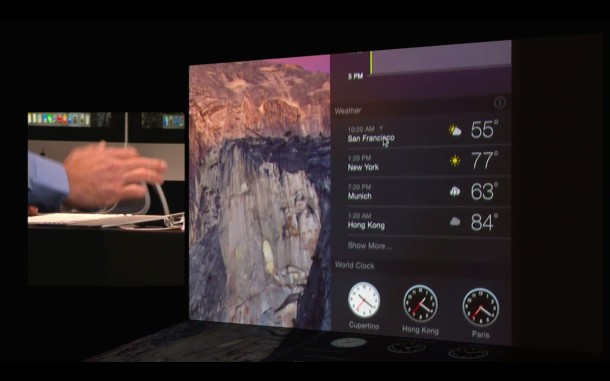
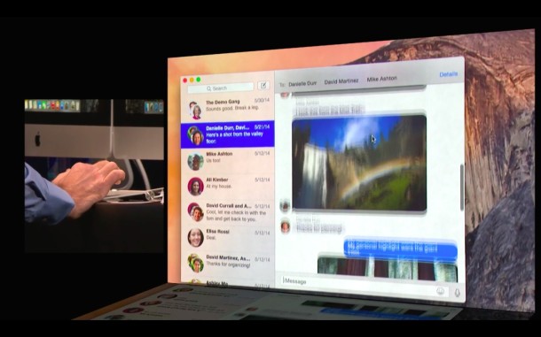
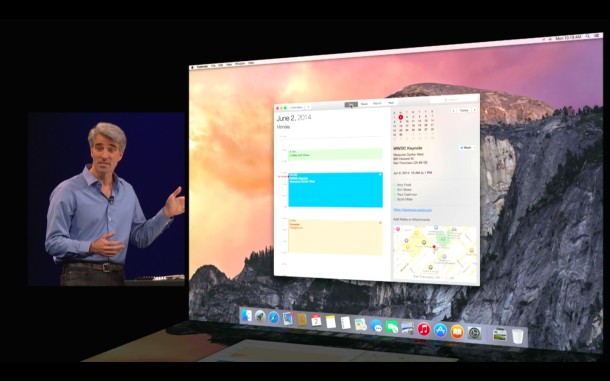
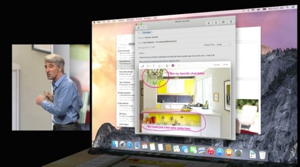
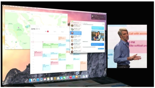
(We’ll post a better screenshot walkthrough later, but in the meantime the below images were captured from the WWDC 2014 livestream)
All New Interface
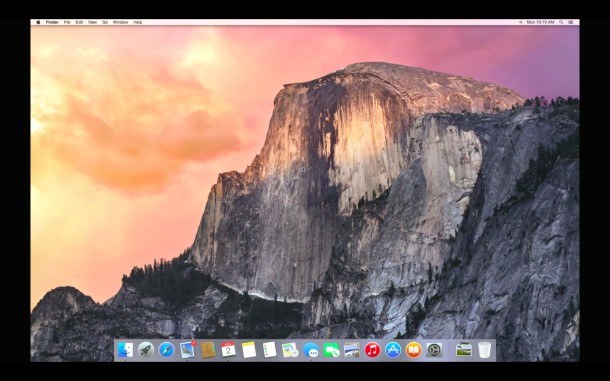
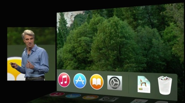
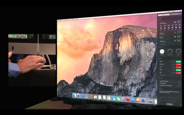
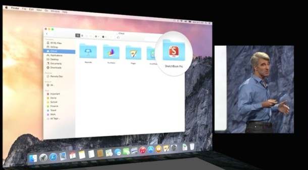
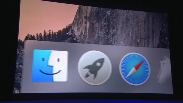
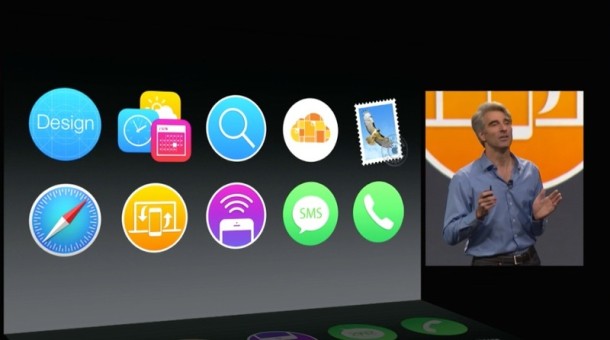
New fonts, new icons, an all new look. You’ll find translucent finder windows, a flat and gorgeous UI redesign, a new Dock appearance. This is very much like the iOS UI coming to the Mac, but arguably it looks better.
The interface is very white by default… but, if you’re not into that, there’s also a “Pro” mode, which has a dark interface that transforms into a dark grey UI rather than the bright whites of the default appearance.
First Look at a Few OS X Yosemite Features
There are tons of new features in OS X Yosemite, here are a few brief highlights of the more interesting features discussed today at WWDC:
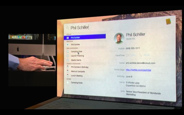
All new Spotlight – Hovers over the screen and functions as search engine for files, information, contacts, restaurants, and so much more.
All New Notification Center – Slides out from the sidebar, and looks very similar to iOS. New widget support allows third party widgets to be added to Notification Center.
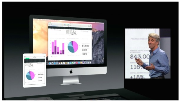
iCloud Drive – iCloud (finally) gets a direct Finder interface with drag and drop support, folders, tags, and across-Mac syncing. Documents also sync to iOS, and even Windows (!).
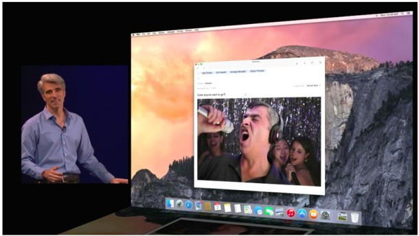
Mail Drop – Want to send someone an enormous document? Instead of bouncing off the mail server due to size limitations, Mail Drop allows users to encrypt documents in the cloud and email downloadable links for files that are up to 5GB in size. For sending to iOS and OS X, the file(s) download automatically and feel seamless, whereas other clients will get ad download link.
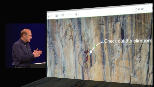
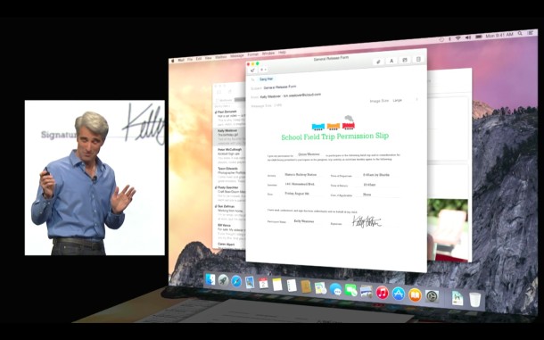
Markup – Built into OS X Yosemite is the ability to doodle, draw, and markup directly on screen and in emails. Handy!
Safari – Revamped UI, native RSS subscriptions built directly into the Reader view, and a new tab browsing view similar to iOS Safari.
AirDrop – Full iOS to Mac support, for direct file sharing between any Mac or iOS device.
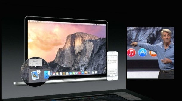
Handoff – You can now ‘handoff’ application activity to iOS or OS X when in proximity to a device. For example, you can start writing an email on your iPhone, then hand it off to Mail app on your Mac when you get to the computer. And vice versa, of course. This should be a huge productivity boost.
Messages – SMS support relays text messages from the Mac through the iPhone, sounds convenient.
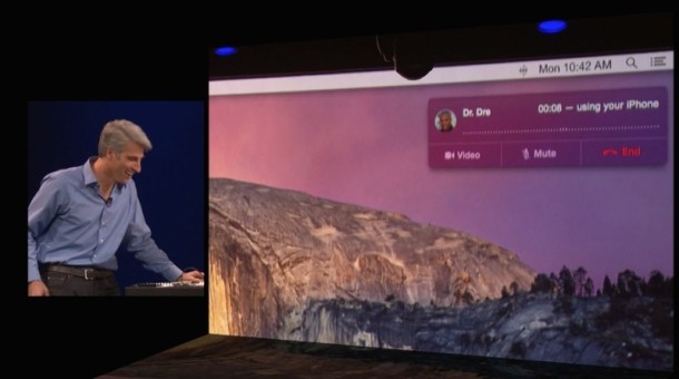
Mac Phone Call Support – The Mac can now make and receive phone calls through an iPhone, complete with caller ID. This relays phone calls from iPhone to the Mac, as long as they are in general proximity to one another.
OS X Yosemite First Look Pictures
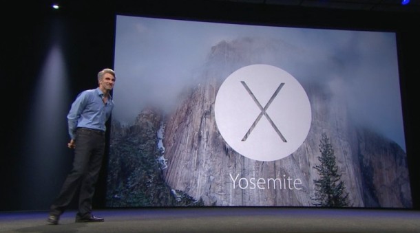
These are all snapshots from WWDC 2014, better resolution images of OS X Yosemite will be available later.
(Thanks to MacRumors Live Stream for a few of the additional WWDC image captures) and OSX Daily

